Every detail,
right on time.
Built around time.
Miunáe begins with time: time given, time honored, time refined. The system is minimal (but never boring), so the main details have room to breathe.
Nothing is added for decoration alone. Every mark, movement, color and surface should feel intentional and enduring.
Elegant
The brand does not compete for attention. It creates space for product, texture, light and language to be noticed.
Precise
Spacing, hierarchy and contrast should feel measured. Nothing loose. Nothing accidental. If a new detail affects the whole thing -- either skip it, or change the whole thing.
Enduring
The system avoids trend-driven noise. If a trend is worth following, we take inspiration and make it our own. We don't copy/paste.
All brand assets here.
The Miunáe logo is built around a single interruption: the hourglass. It replaces the letter "I" as a reminder that time is not added to beauty -- it's part of it.
The other letters stay restrained, allowing the hourglass symbol to carry the meaning. Wherever it shows up, the symbol should always feel balanced and unforced.
Primary Logo
The full wordmark is the default expression of the brand. Use it when recognition, clarity and presence matter most.
Hourglass
The hourglass is our simplest expression of time. Used alone, it acts as both symbol and signature.
Clear Space
The safe zone protects the Miunáe mark from being crowded by type, images, edges or other interface elements. It is measured from the hourglass symbol itself, because the hourglass is the structural center of the logo.
Use
Use the logo on light or dark backgrounds with generous clear space. Let it breathe.
Preserve
Keep the mark in its original proportions. Do not stretch, rotate, redraw or separate the hourglass from the composition.
Avoid
No shadows, outlines, gradients, decorative effects, animation gimmicks or altered typography.
Logo
Primary Miunáe wordmark with integrated hourglass.
Symbol
Standalone hourglass mark.
Clear before expressive.
Geist gives Miunáe restraint: contemporary without feeling trend-driven, precise without becoming technical, elegant without becoming precious.
Geist Mono introduces structure. Use it for labels, specifications, numerical values and small paragraph text. Places where the brand needs confident exactness.
Geist
Headings, body, navigation, interface and campaign language.
abcdefghijklmnopqrstuvwxyz
0123456789
Geist Mono
Technical details, color values, product specifications and asset labels.
abcdefghijklmnopqrstuvwxyz
0123456789
Usage
Large typography should feel close, spacious and architectural. Small typography should feel exact, never cramped.
Hierarchy
Use contrast through scale, spacing and weight. Avoid excessive font styles. The system works best when typography is allowed to breathe.
A narrow palette.
Our color system is intentionally restrained. The grayscale range carries the interface: soft mineral tones, aged paper, stone, shadow and earth.
Dark Red introduces warmth and quiet intensity. Dark Green grounds the system in nature. Both are accents, never noise. Not to be overused.
rgba(232,232,232,1)
rgba(219,215,208,1)
rgba(176,173,168,1)
rgba(140,137,133,1)
rgba(110,107,103,1)
rgba(74,72,69,1)
rgba(46,44,41,1)
rgba(26,24,21,1)
rgba(12,12,12,1)
rgba(91,26,29,1)
rgba(61,74,62,1)
Like time passing.
Motion should feel inevitable, not entertaining. Elements appear, settle and disappear with the same calm confidence found throughout the brand.
If the animation asks to be noticed before the content does, it is moving too far from the system.
Fade
200-400ms.
Information enters without interruption.
Drift
5-10s.
Subtle atmosphere, never distraction.
Breathing
4-8s.
Quiet life inside stillness.
Dissolve
300-600ms.
Soft transitions between states.
Avoid
Bounce, elastic movement, overshoot, spin, heavy parallax, particle explosions, aggressive hover states or anything that makes the interface feel performative.
Minimal, but not sterile.
Miunáe interfaces are simple. Buttons, inputs, cards and navigation should support the content without competing for attention.
Interactions are quiet: a tonal shift, a soft fade, a precise transition. The reader should feel guided, never pushed.
Button
Sharp, precise, mono-labeled. Strong enough to act, quiet enough to belong.
Input
Forms should feel calm and low-friction. Labels stay clear. Borders stay fine.
Expandable Strip
Information can unfold slowly. The closed state should remain clean and exact.
Layout
Use generous spacing, clear alignment, large type, thin borders and very few decorative elements. Space is not empty. It is part of the tone -- but has to be balanced well.
Observed, not staged.
Photography is where the natural world enters the system. Images should feel real, tactile and slightly impossible -- discovered rather than arranged.
Hard directional light, greige neutrals, luminous skin, deep shadows, matte texture, restrained color and small imperfections give the world its presence.
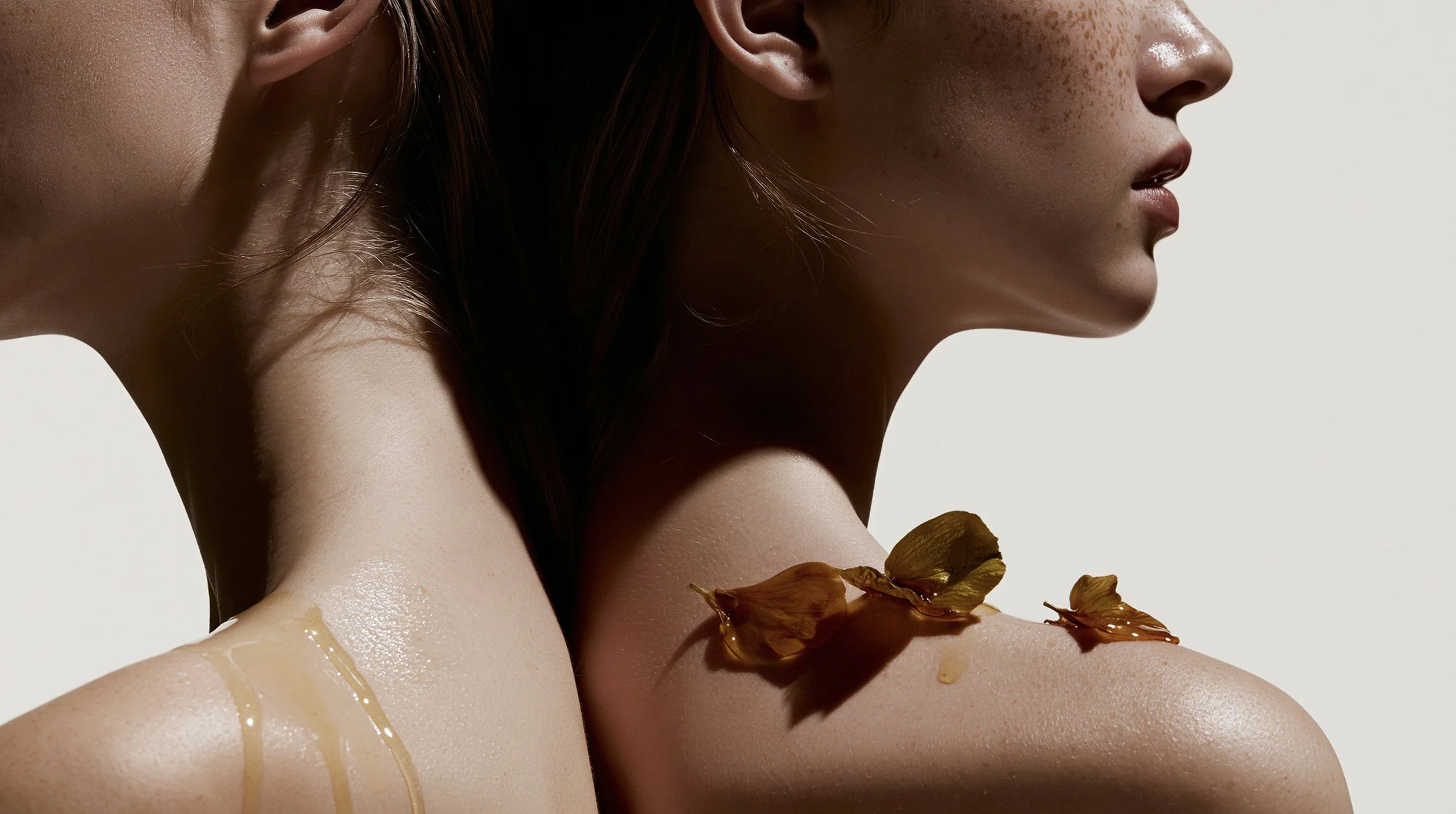
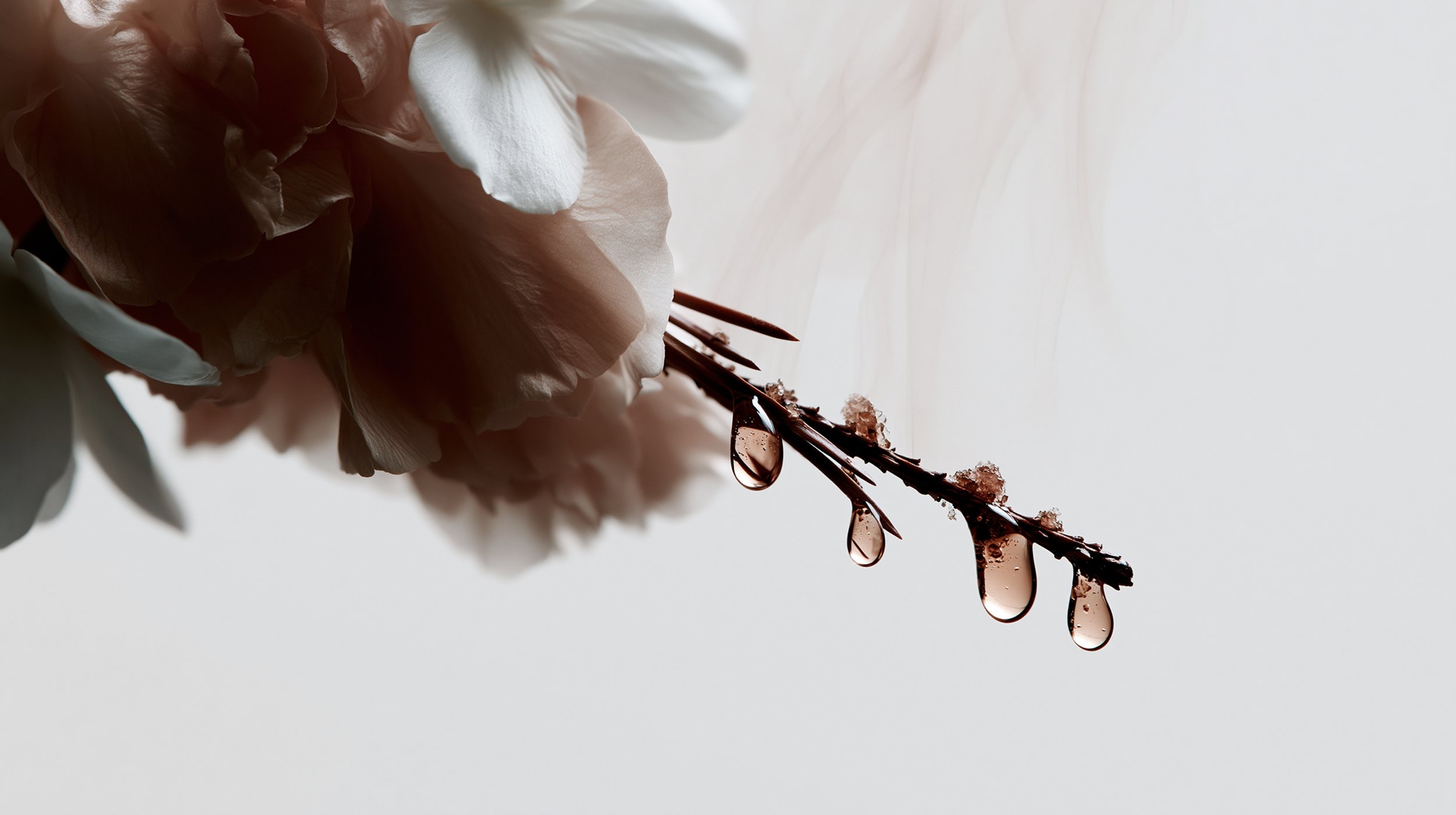
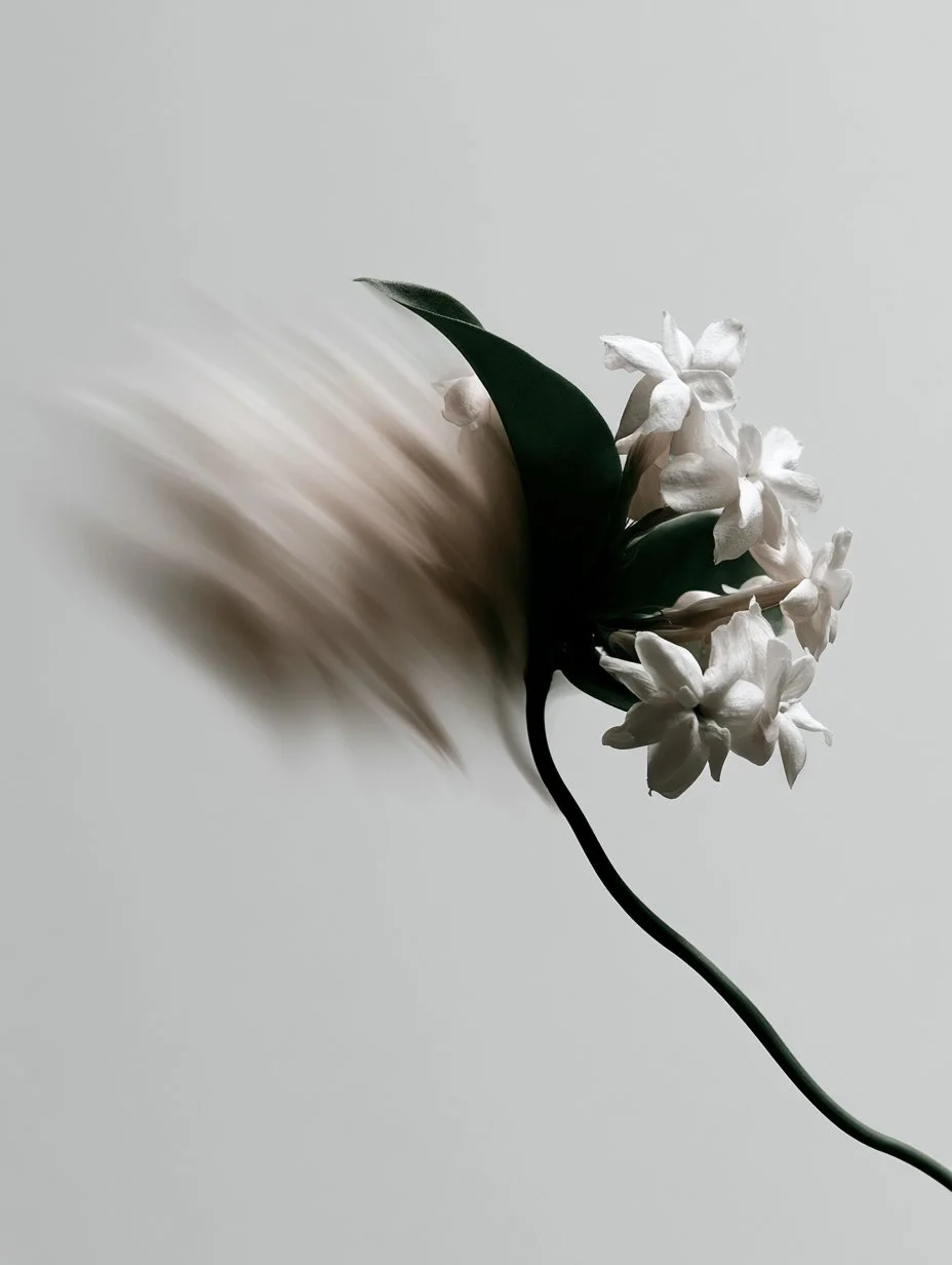
Use
Real skin, glass, paper, soil, petals, roots, fabric, condensation and imperfect surfaces.
Light
Prefer directional light that reveals shape and shadow. Avoid flat lighting that removes character.
Avoid
Glossy beauty ads, fake gold luxury, over-retouching, saturated botanicals and stock lifestyle energy.
Anything unclear?
Reach out at hello@miunae.com with any further questions.